Getting Started
Install the Plugin
Download and install the Table Addons For Elementor plugin from the WordPress Plugin Repository or directly through your WordPress dashboard:
- Go to Plugins > Add New in your WordPress admin area.
- Search for “Table Addons For Elementor.”
- Click Install Now and then Activate.
Access the Table Widget
Once activated, open any page or post using the Elementor Editor. In the Elementor Widgets panel, you’ll find a new widget called Table under the “General” section. You can also search for Table to find it.
Add a Table to Your Page
To add a table, simply drag and drop the Table widget onto your page. A default table will appear in the Elementor Editor, allowing you to start customizing it immediately.
Editing the Table: Content and Style Panels
After adding the Table widget, you will see two main panels in the Elementor Editor: Content and Style. These panels allow you to customize and style your table.
Content Panel
The Content panel is where you define the structure and content of your table. It includes two sections:
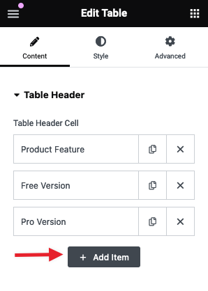
- Table Header: Manage your table’s headers by adding, editing, or removing header cells.
- To add a new header cell, click on the + Add Item button as shown in the image below:
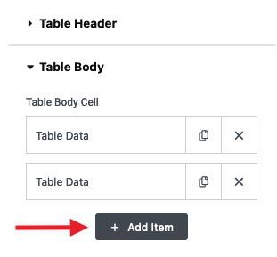
- Table Body: Define the content within the table rows. You can add, modify, or delete rows and cells as needed.
Configuring the Table Header
The Table Header section allows you to customize the header cells of your table. You can add or remove header cells, define their content, and apply various styles and formatting options.
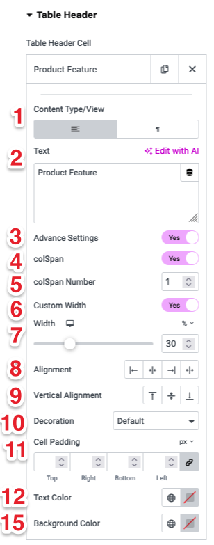
By default, you will see the following options for each header cell:
- Content Type/View: Choose between text or filter type for the header cell content.
- Text: Enter the content for the header cell.
3. Additional settings are available under Advanced Settings. By default, these settings are turned off. To access them, switch the Advanced Settings toggle to “Yes.”
4. colSpan (Default: Off): When enabled, allows the header cell to span multiple columns.
5. colSpan Number: Define the number of columns the header cell should span.
6. Custom Width (Default: Off): When enabled, allows you to set a custom width for the header cell.
7. Width: Adjust the width of the header cell using a slider or input value.
8. Alignment: Set the horizontal alignment (left, center, or right) for the content
9. Vertical Alignment: Set the vertical alignment (top, middle, or bottom) for the content.
10. Decoration: Choose from different decoration styles (like default, underline, etc.).
11. Cell Padding: Adjust the padding for each side (top, right, bottom, left) of the header cell.
12. Text Color: Select the text color for the header cell.
13. Background Color: Select the background color for the header cell.
Table Body
The Table Body section allows you to customize the content and appearance of each table cell in the body of your table. You can manage the rows, format text, and apply various styling options to create a visually appealing and functional table.
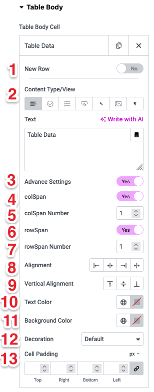
By default, you will see the following options for each body cell:
1. New Row: Toggle to start a new row with this cell.
2. Content Type/View: Choose the type of content for the cell, such as text, image, icon, etc.
- Enter the content for the table cell based on Content type/view
3. Advanced Settings: Additional settings are available under Advanced Settings. By default, these settings are turned off. To access them, switch the Advanced Settings toggle to “Yes.”
4. colSpan (Default: Off): When enabled, allows the cell to span multiple columns.
5. colSpan Number: Define the number of columns the cell should span.
6. rowSpan (Default: Off): When enabled, allows the cell to span multiple rows.
7. rowSpan Number: Define the number of rows the cell should span.
8. Alignment: Set the horizontal alignment (left, center, or right) for the cell content.
9. Vertical Alignment: Set the vertical alignment (top, middle, or bottom) for the cell content.
10. Text Color: Select the color of the text within the cell.
11. Background Color: Select the background color of the cell.
12. Decoration: Choose a decoration style (such as default, underline, etc.) for the cell content.
13. Cell Padding: Adjust the padding for each side (top, right, bottom, left) of the cell to control spacing within the cell.
These settings provide a wide range of options to fine-tune the appearance and functionality of the table body, ensuring it fits perfectly within your page’s design.
Content Type/View Options
The Content Type/View setting allows you to choose the type of content you want to display within each cell of the table body. There are seven types available:
1. Text (Default): The default and free option that allows you to add simple text to the cell.
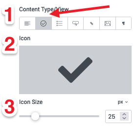
2. Icon (Premium): Display an icon in the table cell.
- Icon: Select an icon to display.
- Icon Size: Adjust the size of the icon using a slider.
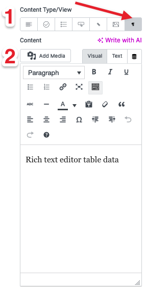
3. Rich Content Editor (Premium): Use a rich text editor to format your text with various styles.
- Content: Enter your text using the rich content editor tools, such as bold, italics, links, etc.
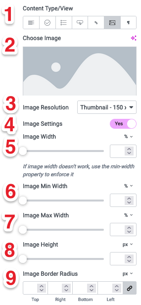
4. Image (Premium): Display an image within the table cell.
- Choose Image: Select an image to display.
- Image Resolution: Choose the resolution of the image (e.g., Thumbnail, Medium).
- Image Settings: Enable to adjust additional settings like width, min width, max width, height, and border radius.
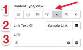
5. Link (Premium): Add a hyperlink to the cell content.
- Link Text: Enter the text that will be clickable.
- Link: Define the URL or destination for the link.
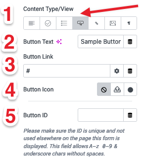
6. Button (Premium): Insert a button within the table cell.
- Button Text: Define the text to display on the button.
- Button Link: Specify the URL or destination for the button.
- Button Icon: Select an icon to display alongside the button text.
- Button ID: Set a unique ID for the button to avoid conflicts.
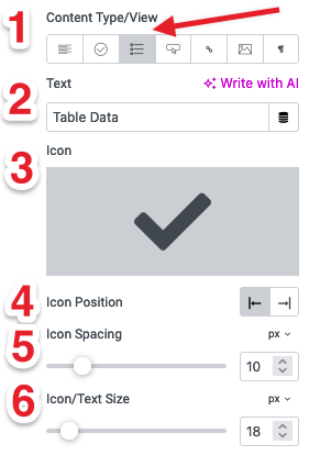
7. Icon + Text (Premium): Display an icon with accompanying text in the table cell.
- Text: Enter the text content to display.
- Icon: Select an icon to display next to the text.
- Icon Position: Choose the position of the icon (before or after the text).
- Icon Spacing: Adjust the spacing between the icon and text.
- Icon/Text Size: Set the size for both the icon and text.
Premium Features
Please note that all content types except Text are premium features and require the pro version of the plugin to be enabled.
Style Settings
The Style tab offers a range of options to customize the appearance of your table, including general styling, header and body customization, button styling, and responsiveness. Note that the Button Style and Responsive Style options are premium features.
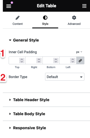
1. General Style
The General Style section includes basic styling options that apply to the entire table:
- Inner Cell Padding: Set the padding for each side (top, right, bottom, left) of the table cells.
- Border Type: Choose the type of border for the table cells (e.g., solid, dashed, dotted).
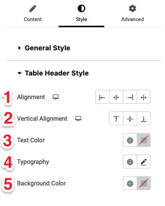
2. Table Header Style
The Table Header Style section allows you to customize the appearance of the header cells:
- Alignment: Set the horizontal alignment of the header content (left, center, or right).
- Vertical Alignment: Set the vertical alignment of the header content (top, middle, or bottom).
- Text Color: Choose the text color for the header cells.
- Typography: Define the font, size, weight, and other typography settings for the header text.
- Background Color: Select the background color for the header cells.
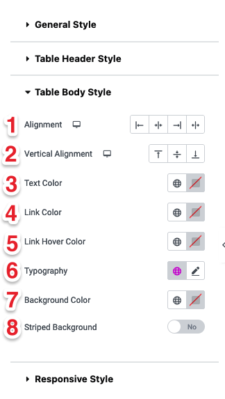
3. Table Body Style
The Table Body Style section provides options for customizing the body cells:
- Alignment: Set the horizontal alignment of the body content (left, center, or right).
- Vertical Alignment: Set the vertical alignment of the body content (top, middle, or bottom).
- Text Color: Choose the text color for the body cells.
- Link Color: Define the color of any links within the table body.
- Link Hover Color: Set the color for links when hovered over.
- Typography: Define the font, size, weight, and other typography settings for the body text.
- Background Color: Select the background color for the body cells.
- Striped Background: Toggle to apply alternating background colors to rows for better readability.
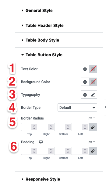
4. Table Button Style (Premium)
The Table Button Style section allows you to style buttons within the table:
- Text Color: Set the color of the button text.
- Background Color: Choose the button background color.
- Typography: Define the font, size, weight, and other typography settings for the button text.
- Border Type: Choose the type of border for the button (e.g., solid, dashed, dotted).
- Border Radius: Adjust the border radius to create rounded corners.
- Padding: Set the padding for each side (top, right, bottom, left) of the button.
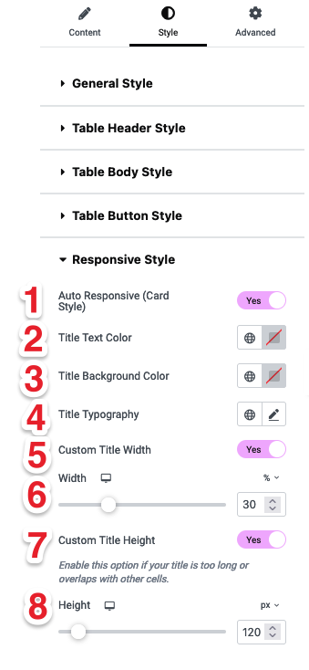
5. Responsive Style (Premium)
The Responsive Style section provides options to make the table mobile-friendly:
- Auto Responsive (Card Style): Toggle to enable a card-style layout for responsive designs.
- Title Text Color: Set the color for the title text.
- Title Background Color: Choose a background color for the title.
- Title Typography: Define the font, size, weight, and other typography settings for the title.
- Custom Title Width: Enable to set a custom width for the title.
- Width: Adjust the title width using a slider.
- Custom Title Height: Enable to set a custom height for the title.
- Height: Adjust the title height using a slider.
Premium Features
Please note that the Button Style and Responsive Style options are only available in the premium version of the plugin.